
I spent an embarrassing amount of one evening trying to match a marigold.
Not a photo of a marigold — an actual one, from the grocery store bunch on my desk, because I was building a palette and I wanted the orange to be right. I eyedropped the petal in three different lights and got three different oranges, none of which looked like the flower. The screen kept making it neon. The print test kept making it mud.
That's the whole problem with Diwali colors in one small failure. They are some of the most saturated colors in any celebration — turmeric, vermillion, magenta powder, gold leaf, flame — and saturated colors are exactly where screens lie to you and printers give up.
So let's get you past the eyedropper stage.
Short version: a Diwali palette is built from four color families — warm golds and saffrons (lamplight), a deep dark to make the light read as light, one or two saturated brights borrowed from rangoli powder, and a jewel accent like peacock teal, royal purple or emerald. The dark is the part people skip, and it's the part that makes the difference. Diwali is a festival of lights. Light needs something to glow against.
Below are six palettes I've actually built and hand-checked, with real hex codes you can copy, plus the one print correction that keeps saffron from going brown on paper. Diwali falls on Sunday, November 8, 2026 this year, so if you're making cards, packaging, rangoli-inspired prints or shop graphics, you've got about six weeks — comfortable, not leisurely.
What colors are actually used at Diwali?
A Diwali color palette is a scheme drawn from the festival's own materials: the yellow-orange of turmeric and marigold, the red of kumkum powder, the gold of oil-lamp flame, and a deep night tone for all of it to sit against. Brighter colors — magenta, azure, emerald — come in through rangoli, the patterns made on floors from colored powder, rice flour and flower petals.
That's the honest core of it. Marigold garlands, clay diyas, colored powder, gold. Everything else is a regional or family variation, and there are a lot of those, which brings me to my caveat early rather than late: I'm a designer, not an authority on anyone's traditions. I build these palettes from the materials and the photographs, and if you're designing for a specific community or family, ask them. They'll tell you things no color guide will.
What I can be precise about is the color science, and there's one piece of it worth knowing before you pick anything.
Why does saffron print muddy when it looks perfect on screen?
Because your screen makes orange out of light and your printer makes it out of ink, and ink runs out of road sooner. A bright saffron like #F09020 sits comfortably inside what a monitor can show and just outside what four-color process printing can hit — so the printer does the only thing it can and lands somewhere browner and darker. Nothing is broken. It's a translation problem.
Two fixes, and neither one is fancy. Lighten before you saturate. If you need a saffron that survives ink, go up in brightness rather than up in intensity — #F8C010 holds far better than a deeper orange pushed to its limit. And give the ink a dark to work with. A saffron next to #20202E reads as blazing; the same saffron on white reads as tired. Contrast does work that saturation can't.
(This is also why every palette below has a near-black in it. It isn't a filler color. It's the lamp's job.)
If you'd like the reference version of this — hex, RGB and CMYK side by side so you can check a color before you commit ink to it — I put together The Color-Confident Crafter Kit: four free downloads I wish someone had handed me when I was still guessing. It's yours for an email, and I only write when I have something worth saying.
Six Diwali palettes, with hex codes
Each of these is a 30-color set; I'm showing you the six anchor hues from each, which are the ones that decide whether the palette works. Copy them straight into Procreate, Canva, Illustrator, wherever you build.
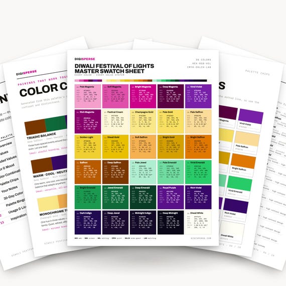
1. Marigold Glow — the one that behaves like lamplight. Deep Midnight #0A0818, Deep Emerald #0A3D25, Royal Purple #5A1088, Bright Saffron #E07800, Golden Light #F0D030, Champagne Gold #FAE888. This is my default recommendation for anything with type on it — invitations, cards, packaging — because the midnight-to-champagne range gives you four usable levels of contrast instead of two. Set the champagne on the midnight and it looks lit from behind. Get the Marigold Glow palette — 30 colors, hex, RGB and CMYK, with Procreate swatches.
2. Diya Lamp — the warm terracotta one. Ghee Cream #FFF6E4, Flame Gold #F5C24E, Terracotta #CE7A44, Burnt Sienna #85401F, Peacock Teal #1B5F63, Midnight #20202E. Built from the lamp itself rather than the flame — unglazed clay, ghee, a wick. The peacock teal is the move here: one cool note in a warm palette stops the whole thing from turning into a pumpkin. This one is on Etsy and not yet on the shop site. See the Diya Lamp palette on Etsy.
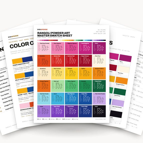
3. Rangoli Powder — the loud one, and the one most people actually want. Rice Flour #FFF6E3, Turmeric #FBCB1B, Kumkum Red #BE1220, Magenta Pigment #E44C97, Azure #3FB4DC, Emerald #1E8E52. Six colors that have no business working together and absolutely do, because that's what powdered pigment on a floor looks like — chalky, unmixed, sitting side by side. The rice-flour cream is the pressure valve; without it the brights fight. Use it as your background and everything calms down. See the Rangoli Powder palette on Etsy (this one's Etsy-only for now too).
4. Rajasthan Spice — the jewel-tone one. Jaipur Pink #E05878, Saffron Orange #E87820, Royal Blue #1030A0, Palace Green #20785A, Sand Fort #D8BB80, Spice Brown #804018. Less festival, more textile — this is the palette for block-print patterns, fabric, anything that wants to look woven rather than lit. That Jaipur pink against the royal blue is the single most satisfying pair in the whole set. Get the Rajasthan Spice palette — 30 colors with hex codes and swatch files.
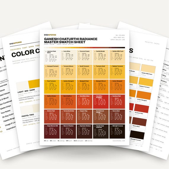
5. Vermillion & Turmeric — the traditional one. Pure Turmeric #F2B705, Marigold Bloom #EE8C0E, Vermillion Kumkum #C92A1E, Sandalwood Henna #8B4A2B, Deep Maroon Silk #5C1A1A, Temple Teak Charcoal #2A1B12. I built this one for Ganesh Chaturthi and it carries straight over, because it's drawn from the same four materials: turmeric, marigold, kumkum, sandalwood. The narrowest palette of the six and the warmest — every color is within shouting distance of every other, which makes it very hard to make ugly. Get the Vermillion & Turmeric palette.
6. Saffron — the monochrome workhorse. Saffron Thread #E08010, Bright Saffron #F09020, Saffron Gold #E09A10, Saffron Yellow #F8C010, Crimson Thread #CC2020, Warm Cream #FFF8EC. Four saffrons, one crimson, one cream. Not a palette for a whole design — a palette for when you need six oranges that are genuinely different from each other and not one of them is going to clash. Gradients, glows, lamp flames, gold foil effects. Get the Saffron palette.
Which Diwali palette should you use for which project?
Here are the six side by side. The “darkest” column is the one I'd check first — it tells you how much contrast range you're getting, and that predicts whether your type will be readable.
| Palette | Lightest | Signature hue | Darkest | Best for |
|---|---|---|---|---|
| Marigold Glow | #FAE888 | #E07800 saffron | #0A0818 | Cards, invitations, type-heavy layouts |
| Diya Lamp | #FFF6E4 | #CE7A44 terracotta | #20202E | Warm illustration, packaging, clay textures |
| Rangoli Powder | #FFF6E3 | #E44C97 magenta | #BE1220 | Pattern, kids' art, bold flat graphics |
| Rajasthan Spice | #D8BB80 | #E05878 Jaipur pink | #804018 | Textile, block print, surface design |
| Vermillion & Turmeric | #F2B705 | #C92A1E vermillion | #2A1B12 | Traditional motifs, puja stationery |
| Saffron | #FFF8EC | #F09020 bright saffron | #CC2020 | Gradients, glows, gold effects |
Two things that table makes obvious. Rangoli Powder has no true dark — its deepest color is a red, which is why it reads as flat and poster-like rather than lit. That's a feature if you're making pattern and a problem if you're setting small text. And Rajasthan Spice has no true light; its lightest note is a sand, so it always feels like fabric rather than paper.
If you want one to start with and you're not sure: Marigold Glow. Widest range, hardest to misuse.
If you'd rather not build any of this from scratch — I already did. Every one of these is 30 colors, not six, with hex, RGB and CMYK values printed in the guide and a .swatches file for Procreate plus .ase for Illustrator and Affinity. They're hand-checked, which in practice means I sat there and corrected the oranges until they stopped lying. Start with Marigold Glow or Rajasthan Spice — and if you're printing rather than posting, keep the hex code chart next to you while you work. It's saved me more reprints than any other thing I've made.
The part I'm still figuring out
Gold. Specifically: gold is not a color, it's a behavior — it changes as the light moves, which is the entire reason people use it for festivals and the entire reason it's miserable to put in a flat palette. #FAE888 is my best current answer for a champagne gold that reads as metallic when you set it against a dark, and I still don't think it's finished. Real gold leaf has a cool green in the shadow that I haven't found a way to include without the palette going strange.
So if you crack that one, tell me. I'm not being modest, I actually want to know.
In the meantime: pick a palette, put the darkest color down first, and build the light on top of it. That one ordering change fixes more festive designs than any color choice does.
Try one of these on something small this week — a card, a story graphic, a single rangoli-inspired tile — and tell me which pair surprised you. I collect these. And if you want the hex-RGB-CMYK reference set to work from, the Color-Confident Crafter Kit is free for an email.
Keep it sunny,
— Kassie
Diwali color palette FAQs
What are the traditional Diwali colors?
Yellow-orange from turmeric and marigold, red from kumkum powder, and gold from lamplight, usually against a deep night tone. Rangoli adds bright magenta, azure and emerald, since those come from colored powder rather than flame.
What is the hex code for marigold?
There's no single official one, but the marigold I use most is #EE8C0E — a true orange-leaning yellow. Petals are lighter at the edge than the center, so if you're illustrating one you'll want a range: #F2B705 for the light edge, #E07800 deeper in.
Is it okay to use black in a Diwali design?
It depends what it's doing. Black and white are widely avoided for clothing and gifts at auspicious occasions in Indian tradition, so a black greeting card is a genuine misstep. A near-black night sky behind glowing diyas is a different thing entirely — that's the dark the light needs, and it's in most traditional Diwali imagery. When it's for someone specific, ask them.
How do I get these palettes into Procreate?
Every palette download includes a .swatches file — open it on your iPad and Procreate installs it as a palette automatically. There's also an .ase for Illustrator and Affinity, and a printable guide with the hex, RGB and CMYK values if you'd rather type them in.
Can I use these palettes in things I sell?
Yes. Color values themselves aren't something anyone owns, and the Digisperse license covers commercial use of the files in personal, commercial and paid client work — you just can't resell the palette files themselves.
Keep making
- Fall Color Palettes With Hex Codes: 8 Cozy Schemes for Real Projects — the autumn cousin of this post, same format.
- How to Import Color Palettes Into Procreate — the step-by-step for that .swatches file.
- Christmas Color Palettes Beyond Red and Green — for when November is over and you need the next dark-plus-light problem solved.
Hi, I'm Kassie — the one-woman team behind Digisperse. With a background in drafting, programming and design, I make print-ready vectors, fonts, color charts, die cuts and stickers — every file checked by hand and ready to use. If something here didn't work the way I said it would, message me and I'll fix it.