
I printed a test sheet last month that I was certain about. Deep teal, a warm coral, a mustard that had taken me three tries to get right on screen. I'd checked it on my monitor, checked it again on my phone, felt good about it.
The page came out of the printer looking like someone had left it in a sunny window for a year. The teal went flat. The coral went brick. The mustard — my poor mustard — went the color of old mayonnaise.
I've been doing this a long time and it still got me. So let's dig into why it happens, because once you can name it, it stops feeling like the printer is out to get you personally.
Short version: your screen makes color by adding light, and your printer makes color by subtracting it with ink — and the ink can't reach as far. RGB (screen) has a wider range than CMYK (print), so the most saturated colors on your monitor have no exact ink equivalent. The printer picks the closest thing it can mix, which is almost always duller. Nothing is broken. The two systems just don't have the same vocabulary.
Here's the part that actually helps: you can see the shift before you print, and you can design so it barely happens.
What are RGB and CMYK, exactly?
RGB is the color model a screen uses: three channels of light — red, green, blue — each set from 0 to 255, added together to make a color. Zero of everything is black (no light). Full of everything is white. CMYK is the model a press uses: four inks — cyan, magenta, yellow, and black — each set from 0% to 100%, laid on white paper to subtract light. Zero of everything is the paper. Full of everything is a muddy near-black.
Same color, two different machines making it — and they don't have the same range.
Hex codes, by the way, are just RGB wearing a hat. #1B4965 is base-16 for R27, G73, B101. (1B is 27, 49 is 73, 65 is 101 — you can check me on a calculator.) So when a palette gives you hex codes, it's giving you screen values. That's useful and it's also exactly why the print looks different.
| RGB | CMYK | |
|---|---|---|
| How color is made | Additive — light added together | Subtractive — ink absorbs light |
| Channels | 3 (red, green, blue) | 4 (cyan, magenta, yellow, black) |
| Value range per channel | 0–255 | 0–100% |
| All channels at zero | Black (screen off) | Bare white paper |
| All channels at maximum | White | Heavy muddy near-black |
| Written as | Hex (#1B4965) or 0–255 triplets |
Four percentages (C/M/Y/K) |
| Depends on a profile? | Usually sRGB, fairly consistent | Yes — SWOP, FOGRA39, and others differ |
| Where it lives | Web, phones, Procreate, Canva, digital art | Offset presses, most commercial printing |
That last row is the sneaky one. There is no single CMYK. A color converted for FOGRA39 (a common European coated-stock standard) and the same color converted for a US coated profile will land on different ink percentages. Which is why “just convert it to CMYK” is advice that quietly skips a decision.
Why do my printed colors look duller than my screen?
Because your monitor is a light source and paper isn't. A screen can push pure green — #00FF00, every green pixel at maximum — straight into your eye. Ink can't do that. Process cyan and process yellow overlapped get you a green, and it's a perfectly nice green, but it is not that green. There's no ink combination that reaches it.
Designers call the reachable range a gamut, and the honest summary is: sRGB's gamut is bigger than a typical process-CMYK gamut in the saturated corners — the electric greens, the neon oranges, the glowing cyans. Anything living out there gets pulled inward to the nearest printable color when you convert. That inward pull is the dullness you're seeing.
The colors that shift the most are the ones you were probably proudest of. Highly saturated brights, especially greens, oranges, and violets. The colors that barely move are the muted ones — dusty roses, olives, warm greys, deep navies. A palette built out of slightly desaturated colors survives the trip to paper almost intact, which is not a coincidence and is a genuinely useful design lever.
(This is also why so many “vintage” palettes print beautifully on the first try. It isn't nostalgia. It's gamut.)
I put together the Color-Confident Crafter Kit — four free downloads I wish someone had handed me back when I was reprinting the same page five times. It's yours for an email, and I only write when I actually have something worth saying.
How do I check a color before I waste paper on it?
Three moves, easiest to hardest.
1. Turn on the proof preview. Most design software will simulate a CMYK profile on screen while you keep working in RGB. In Photoshop and Illustrator it's under View → Proof Setup, then View → Proof Colors. Affinity has a soft-proof adjustment layer. The preview isn't gospel — your monitor is still a monitor — but it will show you which colors flinch, and that's the information you actually need.
2. Print one strip, not one page. A single row of your palette at real size on the real paper tells you more than any amount of squinting at a screen. Cheap, fast, and it catches the paper's contribution too — the same ink on warm cream stock and cool bright-white stock is not the same color to your eye.
3. Compare against a printed reference. This is the one people skip and it's the one that ends the guessing. If you have a sheet of real CMYK swatches printed on paper, with the values written next to them, you stop asking “what will this look like?” and start asking “which of these do I want?” It turns a prediction into a selection.
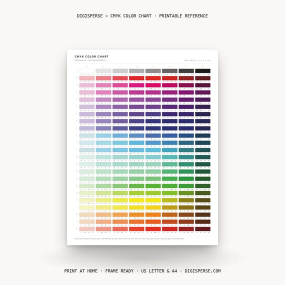
That third one is exactly why I built the charts I did. The CMYK Color Chart is 184 swatches with their process values, built on FOGRA39, made to be printed on your own paper with your own printer so what you're holding is your output, not a promise about someone else's. Its siblings do the same job on the screen side: the RGB Color Chart for 0–255 values and the HEX Code Color Chart for the codes you paste into everything else. Print the pair, tape them above the desk, stop guessing. That's the whole pitch.
When should I actually convert to CMYK?
Later than you think. Design in RGB, convert at the end, and let the conversion be a deliberate step rather than something that happens to you inside a print dialog. Converting early throws away color range you might still want, and it's a one-way door — going back to RGB doesn't restore what got clipped.
Two exceptions worth knowing. If your printer or print shop hands you a specific profile, use theirs, not a generic one; they know their press and their paper and you don't. And if you're only ever printing at home on an inkjet, you may not need to convert at all — most home printer drivers want RGB and do their own conversion internally, and fighting that usually makes things worse, not better.
Black deserves its own paragraph. On screen, black is black. In CMYK there are two of them: flat black (K only, 0/0/0/100) and rich black (black ink plus some cyan, magenta, and yellow underneath). Flat black on a large filled area can look washed and greyish. Rich black looks properly deep — but it's more ink on the page, so it can slow drying, and for small body text it can go slightly fuzzy if the plates are a hair out of register. Rule of thumb I use: rich black for big fills, plain K for text. If a file you converted suddenly has cyan hiding inside its blacks, that's why.
The honest caveat
I can't tell you the exact numbers your printer will produce. Nobody can, from here. Paper, ink, driver, profile, and how recently the heads were cleaned all move the result, and I've had two printers in the same room disagree about the same file. What I can tell you is that the disagreement is bounded and predictable in direction — bright things get calmer, dark things get warmer or cooler depending on your black, and muted things mostly stay put.
So the goal isn't perfect prediction. The goal is not being surprised.
Frequently asked questions
Is RGB or CMYK better?
Neither — they're for different destinations. RGB is correct for anything viewed on a screen: web, social, digital art, digital planners. CMYK is correct for anything reproduced with process inks on a printing press. Choosing “better” is like choosing between a bicycle and a boat.
Why does my print look darker than my screen?
Usually because your monitor is brighter than the paper is. A screen is emitting light at you; paper is only reflecting whatever light is in the room. Turning your monitor brightness down before you judge a design gets you closer to the truth, and judging a proof under normal daylight rather than a warm lamp helps too.
Can I convert a hex code to CMYK exactly?
You can convert it, but there's no single correct answer — the result depends on which CMYK profile you convert into, and some hex codes have no true match at all because they sit outside what ink can reach. Treat a hex-to-CMYK number as “closest available under this profile,” not as a translation.
Do I need to convert files before sending to a print shop?
Ask them. Many shops prefer to receive RGB and run their own conversion with the profile they've dialed in for their press. Sending a file you converted with a guessed profile can be worse than sending the original. Two minutes of asking saves a reprint.
Why are my prints washed out even in the right color mode?
Color mode is only one suspect. Low ink, the wrong paper setting in the print dialog (plain paper settings lay down less ink than photo settings), and a low-resolution source image all produce a flat, washed result that looks like a color-model problem and isn't. Check those before you rebuild your palette.
Keep making
- SVG vs PNG vs PDF: Which File Do You Actually Need?
- How to Import Color Palettes Into Procreate (.swatches, Step by Step)
- Fall Color Palettes With Hex Codes: 8 Cozy Schemes for Real Projects
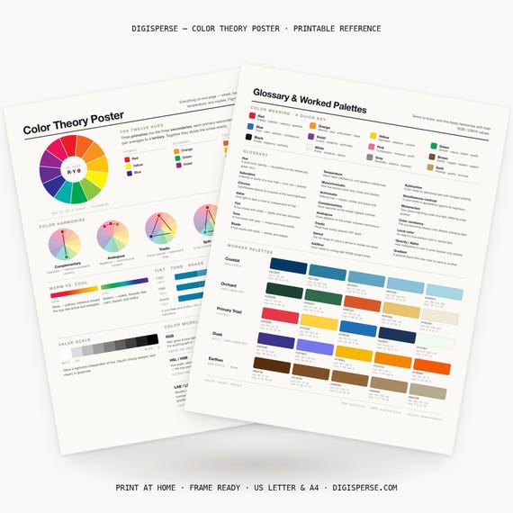
If you'd rather have all three models on one wall instead of three, the Color Theory Poster puts the wheel, the harmonies, and the RGB/CMYK/HEX models on a single printable sheet. And if you want the free stuff first, the Color-Confident Crafter Kit is still four downloads for one email.
Try the proof preview on your next project and tell me which color surprised you most — I genuinely collect these. Mine is still that mustard.
Keep it sunny,
— Kassie
About the maker: Hi, I'm Kassie — the one-woman team behind Digisperse. With a background in drafting, programming and design, I make print-ready vectors, fonts, color charts, die cuts and stickers — every file checked by hand and ready to use.