
I spent most of a Tuesday evening mixing what was supposed to be a simple portrait shadow and getting, instead, a series of increasingly sad greys. Not dramatic greys. Not moody, intentional greys. Just — dishwater.
I'd picked two colors I liked. Individually they were both lovely. Together they cancelled each other out, and it took me embarrassingly long to work out why: one of them was leaning warm and the other was leaning cool, and I'd been treating them like they were the same family because they were roughly the same brown.
So let's talk about undertone, because once you can see it, you stop mixing dishwater.
Short version: a color's undertone is the direction it leans underneath its obvious color — warm colors lean toward yellow, orange and red; cool colors lean toward blue, green and pink-violet. The fastest way to tell is to put the color next to a known warm and a known cool and see which one it looks more like. You are almost never judging a color on its own. You're judging it in comparison, and giving yourself something to compare against is the entire trick.
Here's the part that surprised me, and it's the reason my browns fought: two colors can sit at nearly the same hue and still read as different temperatures, because saturation is doing some of the work. I'll show you the numbers on that further down — they're checkable, and they changed how I build palettes.
What does “undertone” actually mean?
An undertone is the subtle color bias sitting underneath a color's main identity — the yellow hiding in a beige, the pink hiding in a grey, the green hiding in an olive. It's what your eye picks up on before you've consciously named it, and it's why two paint chips that both say “greige” can look nothing alike on the wall.
The word gets used in two places that overlap more than people expect. In design and painting, undertone describes where a pigment or swatch leans. In skin-tone work and personal color analysis, undertone describes the same lean in a complexion — golden and peachy on the warm side, rosy and bluish on the cool side, with a good number of people landing genuinely in between.
Same idea, same test, different subject. Which is convenient, because it means learning to see it once pays you twice.
How do you tell if a color is warm or cool?
Three tests, in the order I actually use them.
1. Compare, don't stare. Put the color between two you're sure about — a clear orange and a clear blue-pink will do. Against the orange, a cool beige suddenly shows its rose. Against the blue-pink, a warm beige suddenly shows its butter. Isolation is what makes undertone invisible; context is what makes it obvious. (This is the whole reason a printed swatch sheet beats a screen full of squares — you can lay things beside each other.)
2. Read the hue number. If you can get at the HSL or HSB values in your software, hue is a 0–360 dial. Roughly: 0–60 and 300–360 are the warm end (reds, oranges, yellows, and the warm pinks), 120–260 is the cool end (greens through blues into violet). The edges are arguable and people do argue about them. The middle of each range is not arguable.
3. Check the grey it makes. Mix or blend your color toward neutral and watch which way the grey tips. Warm colors make warm greys — greys with a hint of brown or mauve. Cool colors make greys that go slightly blue or slightly green. This is the test that finally explained my dishwater: I was mixing a warm brown into a cool brown, and their opposite leans neutralised each other straight down to nothing.
Here's a real side-by-side. These are actual hex values from two palettes I built — the warm column from my Warm Undertones set, the cool column from Cool Undertones — paired at roughly matched lightness so the comparison is fair. The hue and saturation figures are HSL, so you can drop any of these into a color picker and check me.
| Lightness band | Warm swatch | Hue / Sat | Cool swatch | Hue / Sat |
|---|---|---|---|---|
| Lightest | #FFF0DC |
34° / 100% | #FEF0F0 |
0° / 88% |
| Light | #F7D0A8 |
30° / 83% | #F0D8C8 |
24° / 57% |
| Mid | #D4A56A |
33° / 55% | #C8A882 |
33° / 39% |
| Mid-deep | #C68642 |
31° / 54% | #B88878 |
15° / 31% |
| Deep | #8B4513 |
25° / 76% | #7A4048 |
352° / 31% |
| Deepest | #502208 |
22° / 82% | #4A2830 |
346° / 30% |
Look at the “Mid” row for a second. #D4A56A and #C8A882 are both at hue 33°. Identical hue. And they do not read as the same temperature at all — the first one looks like honey, the second looks like stone. The only meaningful difference in the numbers is saturation: 55% against 39%.
I put together the Color-Confident Crafter Kit — four free downloads I wish someone had handed me back when I was mixing my way through that Tuesday. It's yours for an email, and I only write when I actually have something worth saying.
Why does saturation change how warm a color feels?
Because “warm” and “cool” aren't really properties of a single color. They're properties of a relationship.
Drop the saturation on a warm orange-brown and you haven't moved it around the color wheel — you've moved it toward grey. And grey, sitting next to anything with life in it, reads cool. So a desaturated version of a warm hue starts behaving like a cool color, because what your eye is actually comparing is the amount of chroma in the thing, not just its position on the dial.
This is the part I wish someone had told me years earlier, so here it is, plainly: you can cool a color down without changing its hue at all — just take saturation out of it.
Which reframes a saying I'd repeated for years without thinking. “Warm and cool are opposites” — no. Warm and cool are a direction and a distance. Hue tells you the direction. Saturation tells you how committed the color is to going that way. A hue at 33° and 20% saturation isn't a warm color that's being shy; functionally, in a composition, it's a neutral that leans warm. Those are different jobs.
(And yes — this is also why “just desaturate everything” produces those flat, tasteful, slightly lifeless palettes. You didn't remove the colors. You removed their opinions.)
Where undertone actually trips people up
Skin tones. This is the big one, and it's where the stakes feel highest because getting it wrong looks wrong immediately. A portrait shadow mixed with the opposite undertone to the light doesn't look moody, it looks dead — that dishwater again. The fix isn't a better brown. It's picking your shadows and your highlights from the same temperature family and letting the value do the work.
Neutrals that fight. Two beiges, two greys, two off-whites — if one leans warm and one leans cool, they'll read as a mistake rather than a pairing. Not always! A deliberate warm-cool neutral contrast is a real and lovely move. But it has to be deliberate, or it just looks like you couldn't decide.
Matching across tools. A color that looked warm in Procreate can look cool in Canva on a different screen, because your eye recalibrates to whatever else is on the canvas. Undertone judgments made in isolation, on a screen, at night, are the least reliable judgments you will make. Ask me how I know.
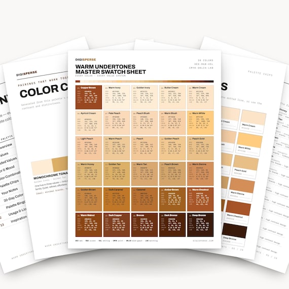
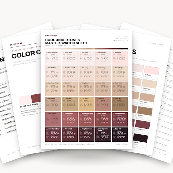
If you'd rather not build these two families from scratch, that's exactly why they exist in my shop. The Warm Undertones Color Palette and the Cool Undertones Color Palette are 30 colors each, built for portrait and figure work, with hex, RGB and CMYK values written out and Procreate .swatches plus .ase files in the download. The honest pitch: you could absolutely build these yourself with an eyedropper and a free afternoon. I already spent the afternoon. If you'd rather spend yours painting, take mine.
The part I still don't have tidy
Neutral undertones. The genuinely in-between ones — skin that goes both ways depending on the light, a beige that refuses to commit, olive complexions that carry a green lean that the warm/cool binary just doesn't have a slot for.
I've read a lot of confident writing about this and I don't think the confidence is earned. My working approach is to stop asking “which one is it” and start asking “which one do I want it to do here” — treat the neutral as a hinge and let the colors around it decide. That's a workaround, not an answer, and I'll write a better one when I have it.
Frequently asked questions
How do I tell if a color is warm or cool?
Put it beside a color you're certain about and compare — a clear orange for warm, a clear blue-pink for cool. Whichever one it resembles more is its lean. If you can read HSL values, hue between roughly 0–60° or 300–360° is warm and 120–260° is cool, but the comparison test is faster and works on anything, including a printed swatch.
What is the difference between hue and undertone?
Hue is the color's main identity — where it sits on the color wheel. Undertone is the subtler bias underneath that identity, which is why two colors can share a hue and still feel different. Saturation is often what separates them: at the same hue, the less saturated color reads cooler.
Can a grey have an undertone?
Yes, and almost every grey does. A grey with a touch of brown, mauve or yellow in it reads warm; a grey with a touch of blue or green reads cool. True neutral grey — equal red, green and blue — is rare in the wild and often looks oddly lifeless when you do use it.
Do warm and cool colors mix well together?
They mix, but they neutralise each other, so mixing a warm and a cool version of the same color tends to produce mud rather than a richer version of either. Placing them next to each other is a different matter and can be very effective — it's the mixing, not the pairing, that flattens things.
Is undertone the same thing as skin tone?
No. Skin tone usually refers to depth — how light or deep a complexion is. Undertone refers to the direction it leans, warm or cool, independent of that depth. Two people with very different skin tones can share an undertone, and two people with nearly identical depth can have opposite ones.
Keep making
- SVG vs PNG vs PDF: Which File Do You Actually Need?
- How to Import Color Palettes Into Procreate (.swatches, Step by Step)
- Fall Color Palettes With Hex Codes: 8 Cozy Schemes for Real Projects
If you want the values on paper instead of on a screen — which, given everything above about comparing rather than staring, is the version I'd recommend — the HEX Code Color Chart gives you swatches with their codes beside them, and the Color Theory Poster puts the wheel and the harmonies on one printable sheet so the warm and cool halves are right there to hold things against. And if you'd rather start free, the Color-Confident Crafter Kit is four downloads for one email.
Try the compare-don't-stare test on something you've been squinting at, and tell me which color turned out to be the opposite of what you thought — I genuinely collect these. Mine was a beige I'd called warm for two years.
Keep it sunny,
— Kassie
About the maker: Hi, I'm Kassie — the one-woman team behind Digisperse. With a background in drafting, programming and design, I make print-ready vectors, fonts, color charts, die cuts and stickers — every file checked by hand and ready to use.